
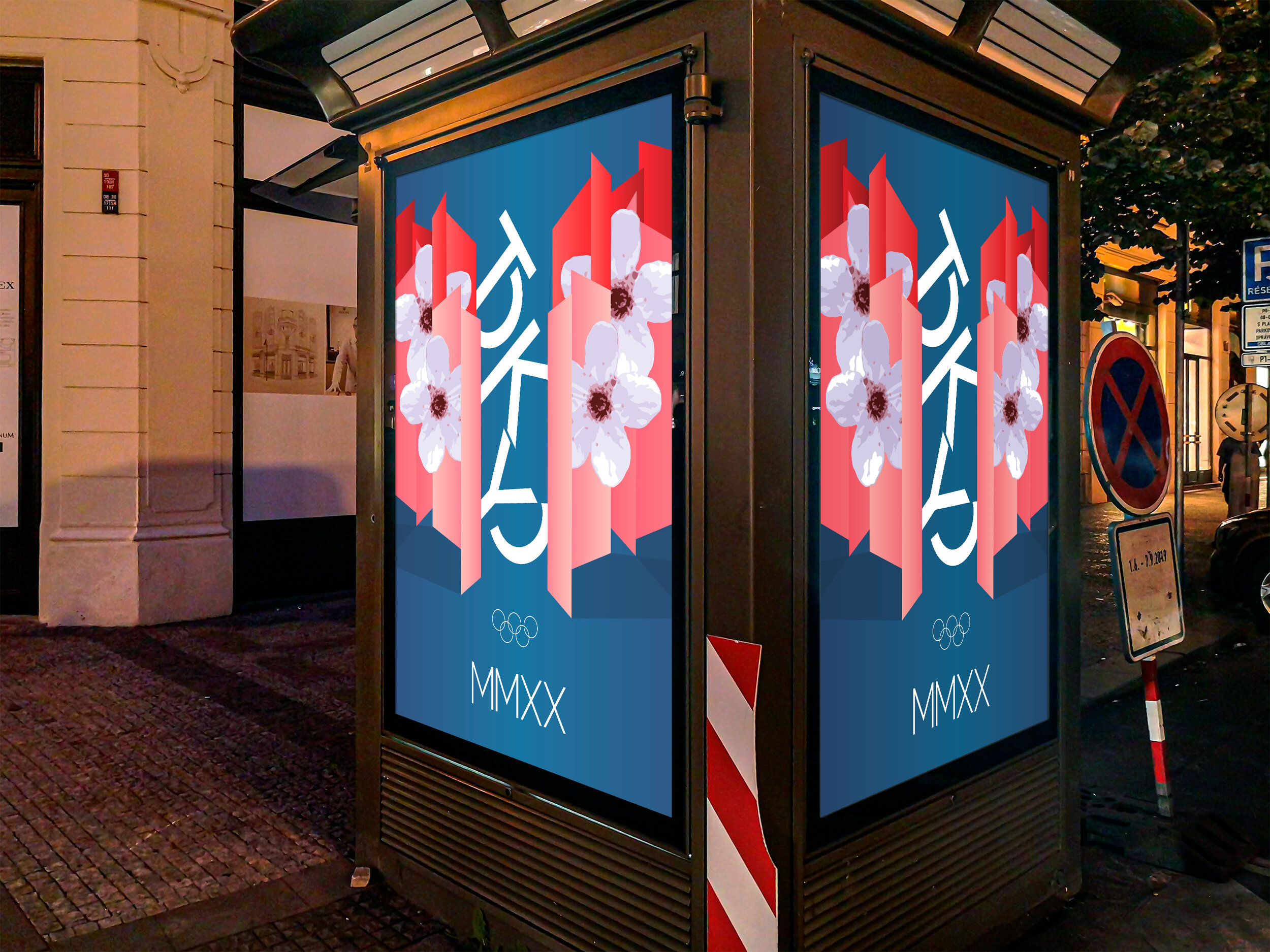

Designing the visual identity for the Summer 2020 Tokyo Olympics. The flowers represent the national flower. The bright red shades represent the dynamic skyscrapers. I wanted to have the poster represent the ‘ultramodern and traditional’ allure of Tokyo.
For ideation, I started with a vertical-type layout. Using many typefaces I freely explored different layouts focusing on legibility and the spirit of Tokyo. The final logo is a vertical logo because traditional Japanese is written in vertical columns. The logo uses two baselines to highlight the pronunciation of the city. The split O’s visually and subtly reference the Hiragana alphabet.
Using the colors and shapes elements of the poster, I designed the banners that live inside the Olympic village. The layout creates depth similar to a point-of-view of walking through the city.